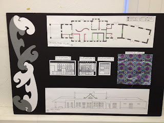
For this semesters final project we were required to renovate the Pufferbelly Train Depot in town into a residence and a studio. For the beginning of the project we had to pick an artist that we could fully interview to get information on what their needs would be when designing them a studio. We faced some obstacles in our design by the visually impaired disability of our clients spouse and the building being on the National Historic Registry. This required us to keep the original facade including all doors and windows, as well as the original ticket window wall inside the train station. For my final design I created a layout based of the glass tiles outside of the Pufferbelly, which led to my concept of The Ripple Effect. My three concept words from the glass tiles were ripple, movement, and fluid. I based my whole design on these three key design concept words. For the artist part of the project I choose my father who owns a construction company. I decided to think outside of the box for this by not choosing an artist who specializes in photos or painting, but rather in wood working. For his profession it required that I give him a lot of space in his studio for big lumber pieces and the large size of each tool used. I also separated his studio and gallery from the rest of the home that way I can keep the public areas from the private residence as well as reduce noise coming from the studio.Using my artist and my concept words I finalized my parti sketch which we turned into a fabric textile that I used in the Gallery bathroom of my design. This Parti sketch used the colors from the original glass tiles and following my concept has more curves and ripples rather than boxes and straight lines. Then we went on to create a bench design based on our concept, parti sketch, and chosen artist. I went against typical bench layout and designed one with more curves rather than straight lines. I also used the same materials and structure as in my concept model, like medal and wood. The legs of my bench design are a replica to the ripples in my original concept model tiring the design together. For my final boards I used the ripple effect on the sides of my boards with toned down colors to give my boards a sense of unity. I am very proud of this project, especially after working on it all semester. I think it turned out really well and enjoyed the challenge of having to design for a person with disabilities. I also enjoyed having to keep certain walls like the ticket window, and keeping the original facade including windows and doors. But more than anything I really incorporating the artist project into my design, especially because I choose my dad as my artist, which let me design for my family and be able to talk to him in person about what he would like in the studio and gallery. While completing it I have noticed that not only drafting skills have increase but my rendering ones as well, which I never thought I would be able to get the hang of. I think my favorite part of the project was building the final model of the Pufferbelly. Being able to visualize my design at a small scale really helped the project come together. Overall I really think this project came together very well. I hope that I will get to do something similar next year.
Introduction
I have created this blog to display my works to my friends, family and interior design professionals. I hope that my work will get me noticed in the interior design profession as a potential candidate for an internship. I have always had a passion for interior design. Working in small spaces like my room to big ones like my house. I hope to expand my education in design to learn more about what I can do in the design field. It is my dream to eventually own my own design firm in Burlington, Vermont.


